Occasionally, I lead workshops and lessons at film clubs, events, camps, or seminars. Here are some selected lesson materials I’ve made for those classes.
Lesson: Dynamic Range
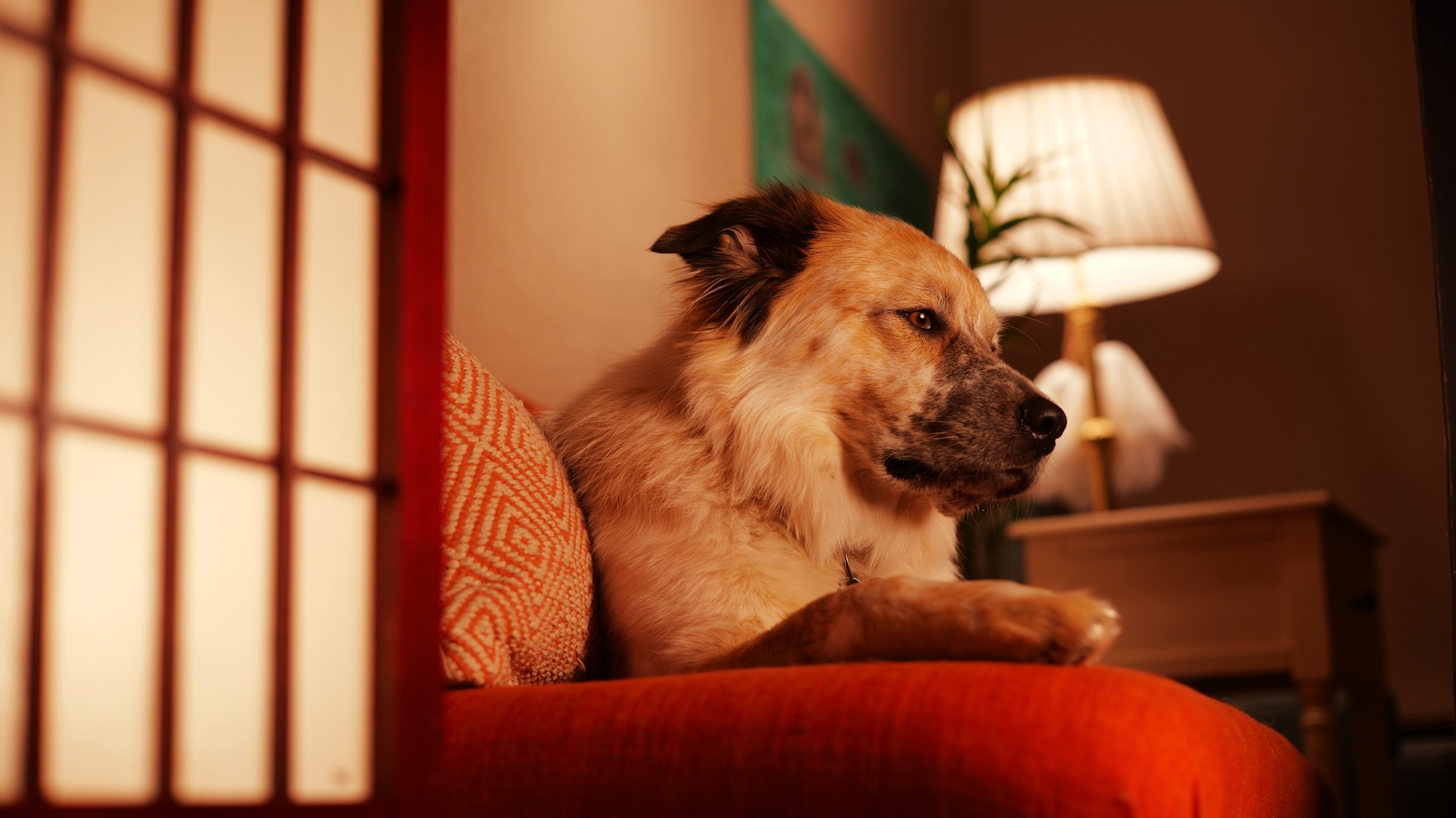
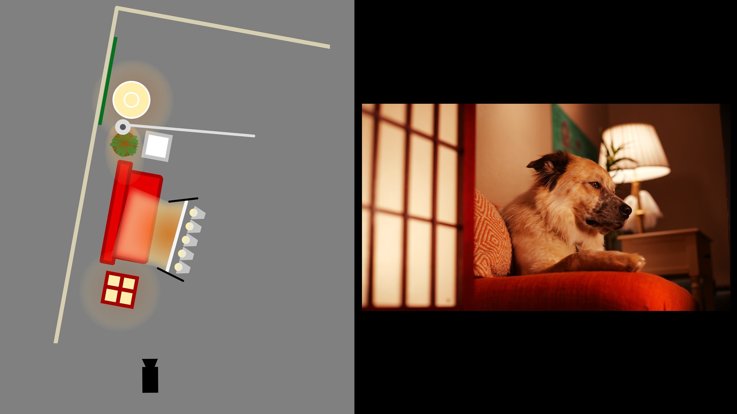
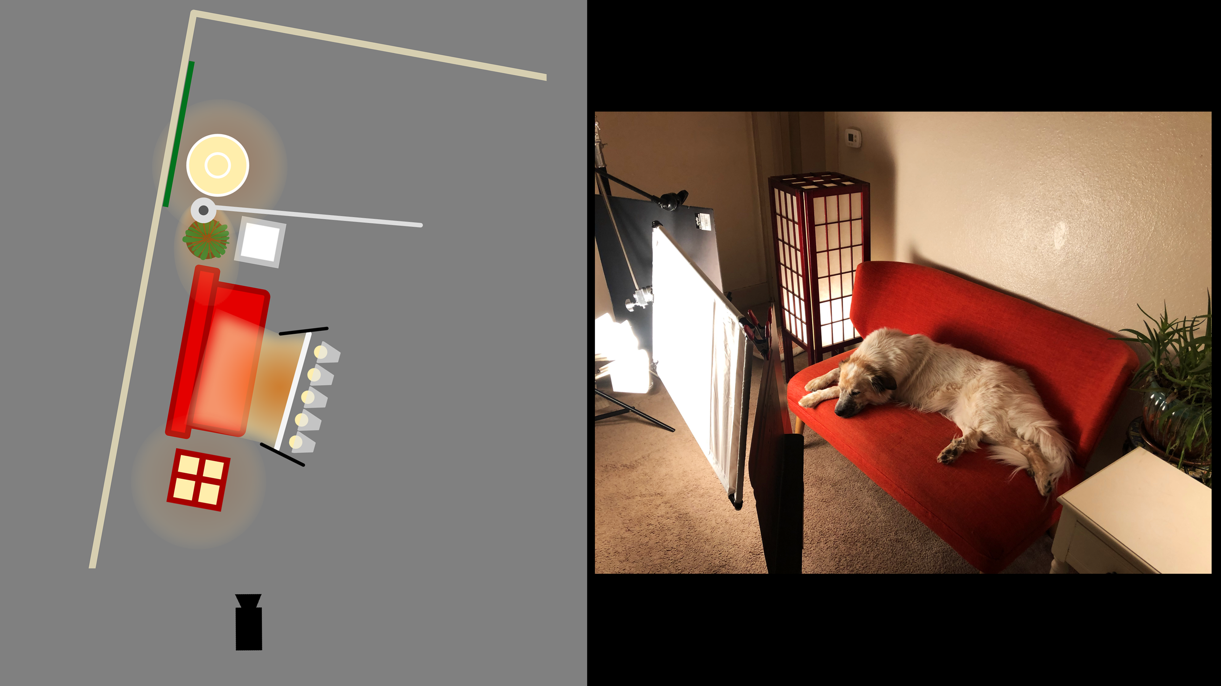
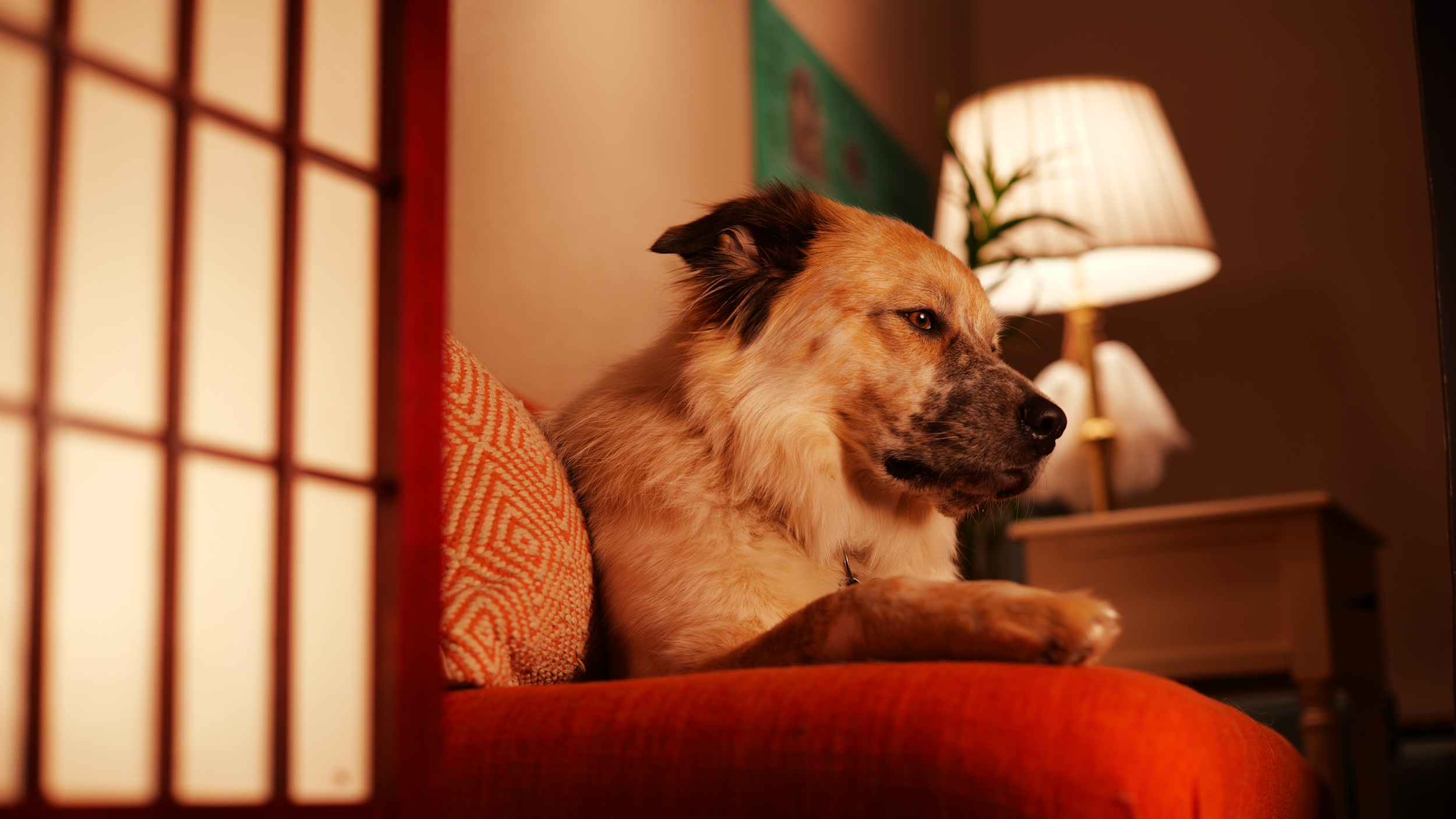
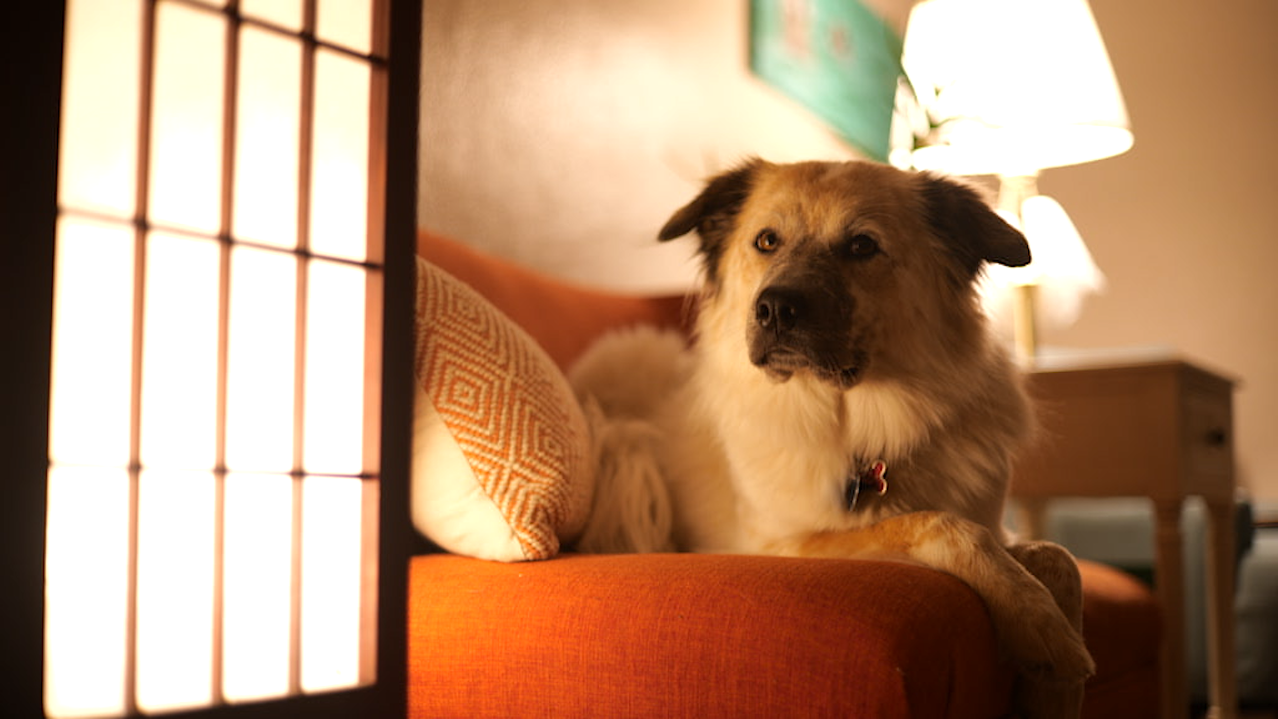
The above lesson is about “Dynamic Range”. In the final shot, (Featuring my dog Škoot) the subject appears to be lit from the lights that you see in-frame (the “practicals”), the lighting looks “natural”. However, both the dog and the lights are properly exposed. How? The secret is that the dog is actually brighter than the lights you see. If she wasn’t, our practical lights would be way over-exposed, blowing out the image.
Lesson: Black, White; Red, Green, and Blue
This experiment/lesson was inspired by this interview with cinematographer Jarin Blaschke (The Lighthouse). Jarin discusses his choice of film stock and color filters to achieve the desired black-and-white look. How do color and brightness interact? In this experiment, I use a single photograph. That photograph is broken up into its red, blue, and green channels across the top row. In the second row, those images are then “normalized”, so that the brightest pixels are equal to white, the darkest equal to black, and the mid-brightness pixels are equal to their original color. Finally, the images are completely desaturated to give us the bottom row. We get radically different black and white images depending on what color channel we started with. Note how the blue channel results in dark and contrasty skin tones, but the subjects blue tinted shirt comes out as almost pure white. The red channel gives us bright and soft skin tones, but a mid-grey shirt.
Lesson: Color Context
Here, my model (affectionately named “Sugar” by my students), is lit by one light source, just off frame right. In each image, the light source is tuned to a different color, indicated on the color wheel. What colors feel natural, like it’s from the light in the room? What colors make the subject stand out most from the scene? These choices create the tone of the image, and can each be the right one in different contexts.
Lesson: Contrast Ratio
This lesson was about the contrast ratio - the difference between the light and dark areas of an image or subject. Here, the subject is lit from the left and the right. The key light, just off frame left, remains constant. The fill light, just off frame right, changes is intensity. When both sides of the face are lit evenly, or close to evenly, the subject appears flatter and less defined. There is a very low contrast ratio. When the subject is lit more on one side, they appear more dramatic and have more defined features. There is a high contrast ratio: the lit area is bright, and the darker side is very shadowed. Contrast is an important component to establishing tone.


